
Ranking the new NBA uniforms
Since 2006, all 30 NBA teams have had their uniforms designed and manufactured by Adidas. But beginning this fall, Nike will take over those exclusive rights. In addition to making some slight alterations to the cuts of the uniforms, Nike has also worked with each team to improve their overall look heading into the 2017-18 season.
So far, we’ve gotten a look at every team’s home and road sets, rebranded as “association” and “icon” uniforms because there will no longer be an exclusive “home” and “road” uniform. And by opening night in October, Nike will have introduced at least two more uniforms for each team. Here are the rankings for the uniforms shown so far.
(Old jerseys on left, new on right.)
25. Indiana Pacers
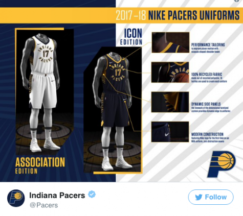
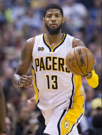
Congratulations to the Pacers, for officially sporting the most hideous jerseys in the NBA. They’re part of a rebrand that will include a new secondary logo (seen on the waistband in the jerseys below) and a court re-design. Although this rebrand was well overdue and necessary, it was not done the right way and this risk and has failed miserably.
24. Orlando Magic
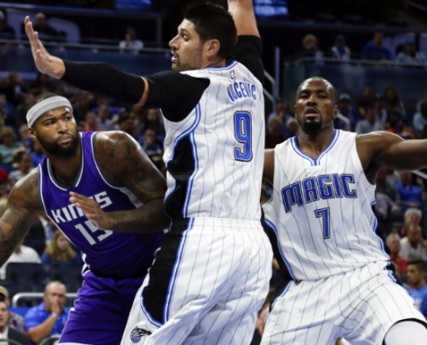
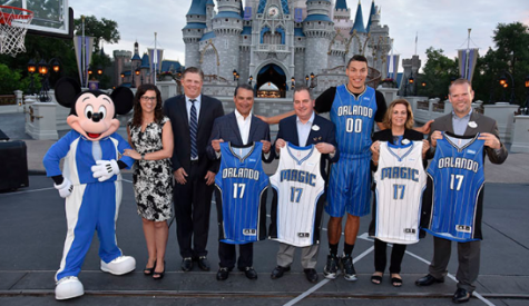
Pinstripes should be against the NBA’s uniform policy. That’s it, bottom line, the end. What’s even worse about these uniforms is that they added a black outline to make the pinstripes pop! I just don’t understand.
23. Denver Nuggets
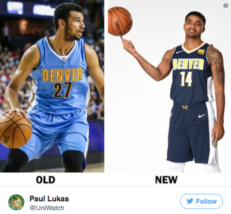
Never. Get. Rid. Of. Powder. Blue. Just don’t do it. Being aesthetically unique is such a rare quality among uniforms nowadays that squandering the last threads of it for a dull navy-blue-and-gold ensemble that only another million teams offer is disappointing. In their all-powder-blue and white-and-powder-blue uniforms, the Nuggets had something special, something different. Now, they just look like a more generic version of the Pacers.
22. Miami Heat
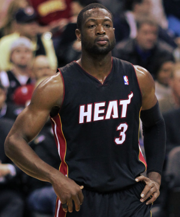
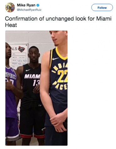
Nothing much to say about the Heat. The only difference from last year’s to this is that they slapped on the city name and removed the mascot name.
21. Oklahoma City Thunder
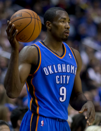
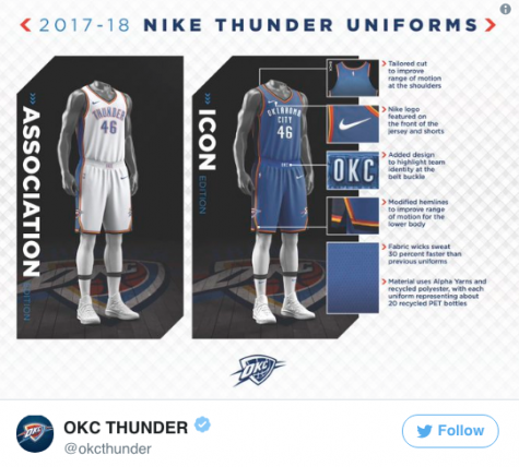
The Thunder have sported these junk jerseys for over a decade now and it’s starting to get a little frustrating. I mean what’s with having orange, navy blue, black, and white in the same color scheme? It doesn’t even go together! The worst thing about these is that this PROFESSIONAL FRANCHISE thought that these jerseys are okay. Wow.
20. Dallas Mavericks


Boring jerseys for relatively boring team. How fitting!
19. Los Angeles Clippers
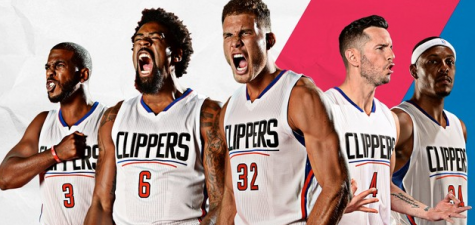

The Clippers—home of this shameless logo and to this mascot—don’t always make solid brand choices. But their new Nike jerseys are appealing: clean, blue, and best of all, simple. Blake Griffin’s spokesperson (I refuse to believe Blake actually spoke these words) said the uniforms captured the “essence of the team and city.” And, at least they got rid of the horrendous underline of the team name from last year. Until they actually change their logo, they find themselves towards the bottom of my list.
18. Toronto Raptors
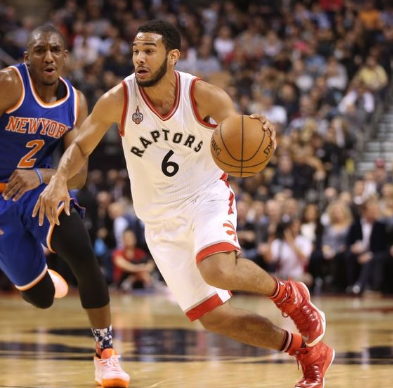
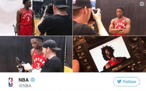
Something about a name curling around a number looks odd to me. Not to mention the fact that the team name has no interesting font. Maybe by adding a couple of claw marks and wrinkles on the lettering would make it better. Or just put a giant raptor on the front and it might look better than this.
17. Detroit Pistons
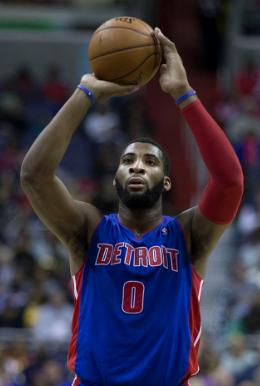

There’s nothing much to really say about this uniform. Usually teams that don’t change their uniform concept already have a positive from their original design. A jersey this generic has no positives.
16. Houston Rockets
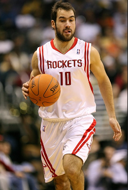
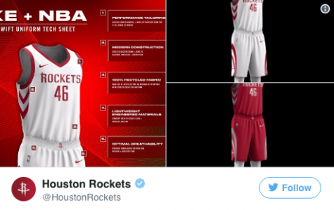
I always wondered what the Rockets were trying to do with the double lines on the shoulders. Was it some kind of outer-space effect they were going for? Was it just because they wanted to be different? I never figured it out, but it seems like Houston didn’t either. Their new look gets rid of the double shoulder lines and keeps it simple with the single, bolded outline in both the red and white uniforms. As a whole though, this jersey is pretty bland.
15. New Orleans Pelicans
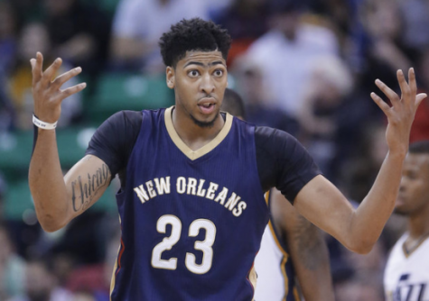
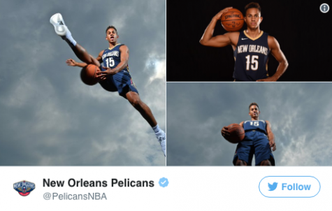
You know there’s a problem when the Utah Jazz can capture the spirit of your city more than you can. Seriously. Think about that for a second.
14. Brooklyn Nets
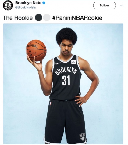
In this era basketball, uniforms this boring do not belong unless it’s a classic. And the Nets jersey is definitely not a classic; but the worst part about it is that it’s another uniform ruined by an ad. Being that they are out of Brooklyn, there could have been a better concept for this.
13. Golden State Warriors
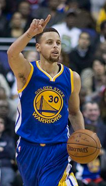

Three straight NBA Finals appearances have given the Warriors no choice but to keep them. But they could have done something to change that neck trimming, I mean what even is that?
12. Memphis Grizzlies
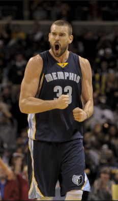
The Grizzlies’ tweaks to their new uniforms are sleek. They’re out here to prove that minimalism can be done exquisitely. Memphis removed a very out-of-place golden stamp from the neck collar, and opted for a thicker, white-and-blue line that gives the uniform some depth without making it tacky. They removed the team’s grizzly logo from the bottom of their shorts and, though I love the logo, I can’t say I blame them. There’s no need to overcrowd when keeping it clean is the move. Oh, and thank you, Grizzlies, for salvaging the powder blue and placing it prominently on the side piping. Take note, Denver.
11. Atlanta Hawks
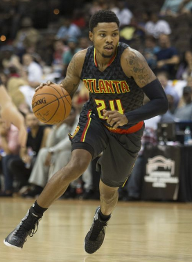
For the most part, the design of the Hawks jersey is on point and even though it was made by Adidas it looks like something Nike would have created. But one thing I was hoping Nike would address was the neon yellow color that for some reason Hawks use. I honestly hate it and the color remains in the very front of the jersey, so that’s why they find themselves barely missing the top ten.
10. Utah Jazz
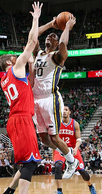
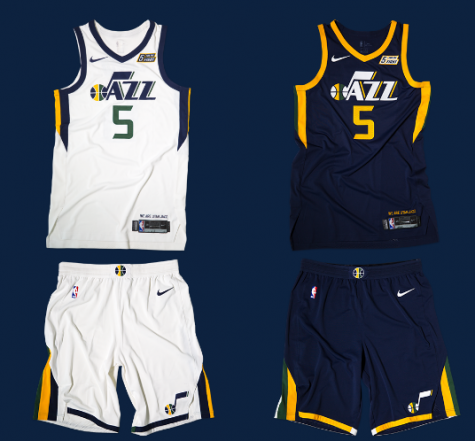
After rocking one of the most beloved uniforms in league history in the late-90s and early 2000s, the Jazz underwent one of the worst NBA rebrands ever in 2004. Thankfully, they’ve found their way in recent years, returning to a look more reminiscent of their pre-Salt Lake City history in New Orleans. Also, the fact that they are using their sponsorship patch to raise money for a cancer charity is a definite bonus.
9. Philadelphia 76ers
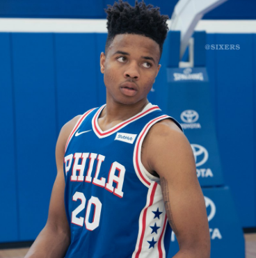
Look at these and try to tell me that you don’t think that these are throwback uniforms. Don’t even waste your time because it’s impossible. The 76ers went back with the original ‘’Phila’’ across the chest, and they even added a drop shadow. With the funky stars on the side, this jersey is straight out of the ’90s.
8. Minnesota Timberwolves
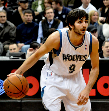
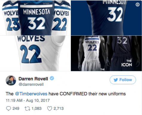
When the Wolves released their uniforms, I loved them from the start because of their boldness. I look at them and admire the different style, with the highly placed team name and thick horizontal lines. Overall, their boldness is what places them high on the list.
7. Charlotte Hornets
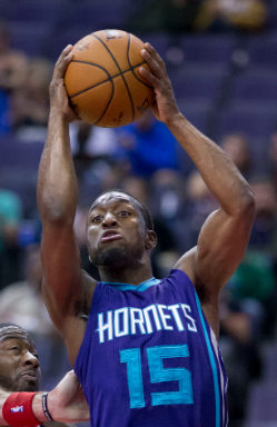

Charlotte opted not to make any substantial changes to their look this coming season, but that’s okay. The Hornets have one of the best color schemes in all of sports, and these uniforms do a nice job of highlighting that awesome light blue and purple combo. The fact that they’ll be the only team in the league with owner Michael Jordan’s Jumpman logo on their right breast instead of the Nike swoosh is a huge bonus.
6. Sacramento Kings
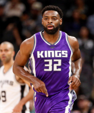
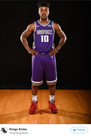
Almost everything about this jersey is on point. They may not be one of the most competitive teams in the league, but they will definitely be one of the best dressed. Although only minor changes were made to the actual jersey design, putting the name in silver really makes this one pop.
Before we move on to our much anticipated top 5, we have 5 jerseys that were not ranked. Being that they were classics, these jerseys were virtually untouched. Messing with a classic is a complete no-go, so it’s good to see that these jerseys have not been changed.

And now, back to the countdown.
5. Milwaukee Bucks
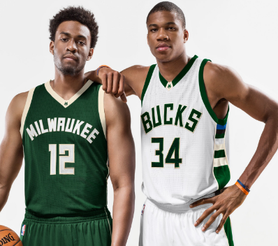

These jerseys are still a great example of what happens when an organizational rebranding is done the right the way. Paying homage to the team’s popular “Irish Rainbow” sets from the late ’70s and ’80s, makes me think that these jerseys will be a classic for a long time to come.
4. Washington Wizards
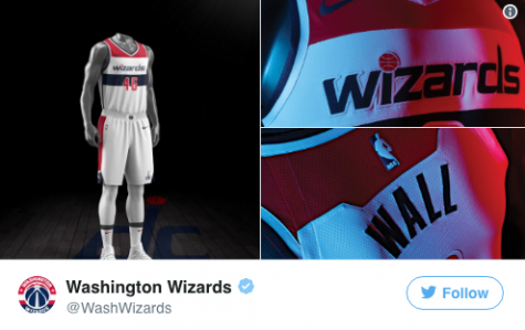
For years after changing their identity from the Bullets to the Wizards in 1997, the NBA team representing America’s capital dressed in a gaudy combination of teal and bronze that was even more offensive than their violent former name. But several years ago, they returned to a patriotic striped look more befitting D.C.’s home squad. They’ve basically kept things the same since then, and even after more than half a decade they still look fresh.
3. Cleveland Cavaliers
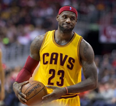
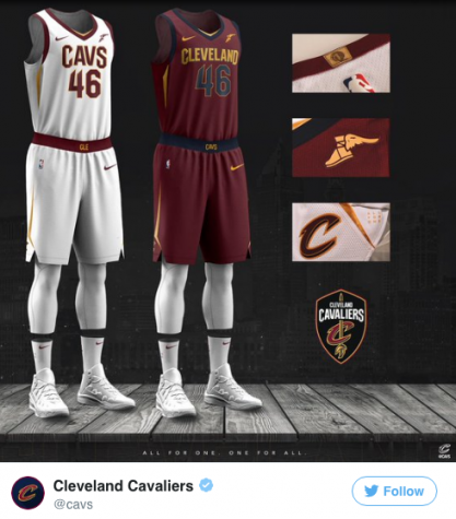
In recent years, the Cavs experimented with wine, navy, gold, black and white, and it’s been hard for them to carve a specific brand. With this new uniform, they were able to connect a clean look with their existing identity to create a jersey that will likely stick for years to come. Not to mention, the Goodyear logo on the left breast adds a nice touch.
2. Phoenix Suns
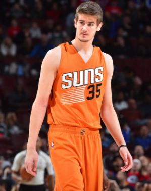
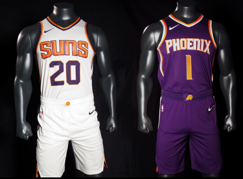
As one of the teams who underwent one of the largest changes under Nike, the Suns really knocked this out of the park. After absolutely, in basketball terms, bricking the crap out of their 2013 rebrand and embracing a largely purple free aesthetic, Phoenix seems to have learned their lesson. These might not be as legendary as the sunburst uniforms of the ’90s, but they are worthy of winning a second place trophy.
1. Portland Trailblazers
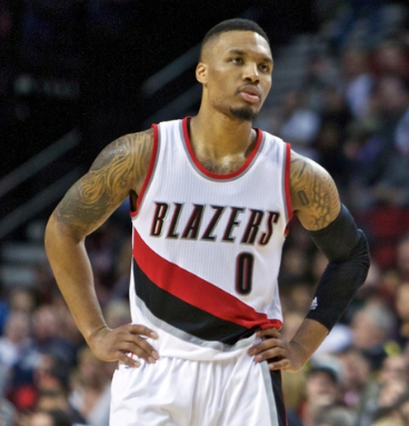
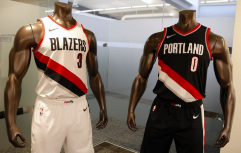
Bravo…These may not be a huge departure from the jerseys the Blazers have worn for the past half century, but they’re absolutely beautiful. Of all the teams that took the switch to Nike as an opportunity to introduce some slight tweaks to their uniforms, Portland did it best. In the end, they made improvements to their team name, numbers, and piping, while adding a cool “Rip City” patch on their waistband.


